


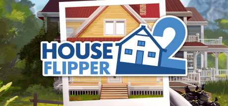

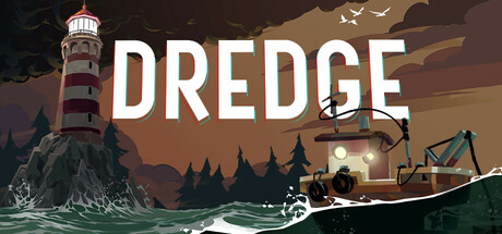

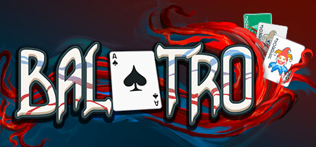



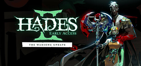









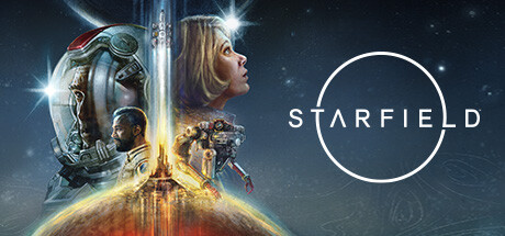




The embed above is the quick check. The full Steam capsule analyzer scores your whole store page 0-100, tests your thumbnail, and ranks the fixes.
Why the capsule decides whether you get a click
Before launch, your Steam page has one job: turn attention into wishlists.
And those wishlists are worth fighting for. Industry wishlist-to-sale conversion has fallen from roughly 20% in 2018 to 5–10% in 2026, per Immutable's analysis of Steam wishlist conversion rates. A stronger capsule widens the top of the funnel to offset that drop: more clicks become more wishlists, and you need more wishlists than the old math implied to hit the same launch sales.
But players do not start by reading your description. They see a capsule in search results, upcoming lists, Steam Next Fest, discovery surfaces, genre pages, creator posts, Discord links, and social shares. Most of the time, they are scanning fast.
That means your capsule has to answer three questions before the player thinks:
- What is this?
- Is it for me?
- Is it worth opening?
The best capsules reduce effort. They do not ask the player to decode the art, zoom into the title, or guess the genre from a mood piece. They make one clear promise.
A better capsule will not make Steam feature your game by itself. Steam visibility depends on player response, purchases, play, tags, reviews, and other signals. But when Steam, a creator, or your own marketing puts your game in front of someone, the capsule is often the thing that earns the click.
The five capsule types and their sizes
“Steam capsule” is not one image. Valve asks for five, at five different aspect ratios, and each one surfaces somewhere different. You upload all of them, because Valve uses whichever one the surface calls for and a missing capsule means your game simply does not appear there.
| Capsule | Size | Where it appears |
|---|---|---|
| Header | 920 × 430 | Top of your store page, Recommended For You, Big Picture browse, Daily Deals |
| Small | 462 × 174 | Search results, top sellers, new releases, and most other lists. Steam auto-renders it down to 184 × 69 and 120 × 45 |
| Main | 1232 × 706 | The main capsule carousel on the Steam store home page |
| Vertical | 748 × 896 | Front page during seasonal sales, and other sale pages |
| Library | 600 × 900 | The player's own library, after they own the game |
The small capsule is the one to design for first. It is the workhorse of Steam discovery, and at 120 × 45 it is the harshest test any capsule faces: if the title, subject, and genre signal survive there, the larger versions almost always work. For the full breakdown, including rendered sizes, file formats, and the localised and seasonal variants, see our reference guide to Steam capsule sizes.
The 6 dimensions, in plain English
These are the criteria Steam Analyzer scores every capsule against. You can apply them by eye before you upload your capsule to Steamworks.
01. Genre clarity
Can a player name the genre at tiny size (120×45) in under a second?
Players should not need the store description to understand the basic type of game. The harshest test is the smallest one. At 120×45 px the capsule is little more than a silhouette and a colour, and the genre still has to land.
A city builder should read as a city builder. A survival horror game should read as survival horror. A deckbuilder should not look like a generic fantasy RPG unless the cards, UI language, or strategic framing are visible enough to carry the signal.
Genre clarity does not mean being boring. It means using the visual shortcuts your audience already understands: scale, camera angle, character pose, environment, props, enemies, buildings, vehicles, cards, weapons, UI motifs, or the kind of threat in the scene.
A strong test: cover the title and show the capsule to someone for one second. Ask: "What kind of game is this?" If they only answer with mood words like "dark", "cute", "epic", or "fantasy", the capsule may be attractive but not clear enough.
Top scorers on genre clarity
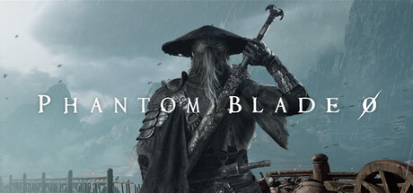
Phantom Blade Zero
Genre Clarity: 9.0/10

Street Fighter™ 6
Genre Clarity: 10.0/10

Farming Simulator 25
Genre Clarity: 10.0/10
02. Title readability at thumbnail size
Is the title still legible at 184×69?
The title is not a decoration. It is the name the player needs to remember, search, mention, and wishlist.
Most capsule titles fail because they were designed at full size and approved in Figma, not tested at real Steam sizes. Thin strokes disappear. Decorative fonts turn into texture. Glows blur. Long titles become grey blocks. The game may look premium in isolation and still fail in the store grid.
Make a small-capsule version of the logo if you need to. The small capsule does not need to be a perfect crop of your main key art. It needs to work in the places Steam actually shows it.
Use this rule: if the title is not readable when you step back from your screen, it is not ready.
Try it
This is the same size simulator we run on every analysis. Tap through the sizes. The capsule on the smallest setting is the only one that matters for legibility.
Top scorers on title readability
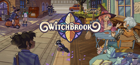
Witchbrook
Title Readability: 9.0/10

Resident Evil 4
Title Readability: 9.0/10
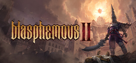
Blasphemous 2
Title Readability: 9.0/10
03. Contrast and colour
Does the focal subject jump off the background?
A capsule needs separation. The player should know where to look without hunting.
The common mistake is using beautiful art where every part has the same visual weight. Dark character on dark background. Warm title on warm fire. Blue logo on blue sky. Detailed subject on detailed environment. It may look expensive, but it does not pop.
Check the capsule in grayscale. Squint at it. Put it on a dark Steam-like background. The title, subject, and background should sit on different value layers.
Saturation is not the same as contrast. A loud capsule can still be unclear. The goal is not to make everything brighter. The goal is to make the important thing impossible to miss.
Grayscale test
This is the same value-contrast check the analyzer runs. If the subject and title still pop after the colour is stripped out, contrast is doing real work. If everything blurs together, saturation was carrying the image.

Top scorers on contrast & color
Deep Rock Galactic: Rogue Core
Contrast & Color: 9.0/10

Two Strikes
Contrast & Color: 10.0/10
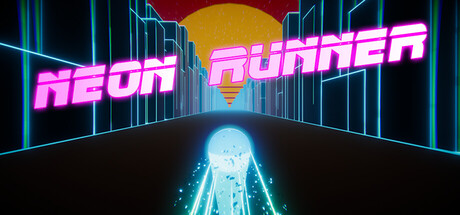
Neon Runner
Contrast & Color: 10.0/10
04. Uniqueness and polish
Does the capsule look like 200 other capsules in the same genre?
A player should be able to remember your capsule after scrolling past it.
This is where a lot of competent capsules fail. They use the right genre signals, but in the same way as everyone else: lone hero, blue mist, red monster, tiny logo, generic background, no specific idea.
Your capsule needs one ownable hook. A strange silhouette. A distinctive face. A specific world detail. A strong graphic shape. A title treatment that belongs to your game and no one else's.
Polish matters too. Cropped limbs, muddy lighting, fake-looking compositing, mismatched fonts, and AI-looking texture all create doubt. Players may not be able to explain why it feels cheap, but they feel it.
Put your capsule in a grid beside 20 games your audience already knows. If it disappears, keep working.
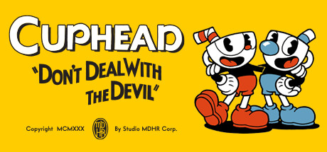
Top scorers on uniqueness & polish

05. Brand consistency
If a player saw three of your capsules in a row, would they know they were yours?
Brand consistency is scored on internal cohesion. Not capsule vs screenshots. Not capsule vs trailer. The question is whether your capsule has a recognisable identity. A signature you could carry across other games or other capsules in your library and players would still spot the family resemblance.
Studios that score well here have a kit: same font family, same stroke or shadow treatment on the title, the same kind of accent colour, a consistent way of placing the logo. Across multiple capsules in their library you can feel the same hand at work.
Mood language is the other half. A studio that's known for a specific lighting style, a specific framing, or a specific subject type builds memory in a player's brain. The next time their capsule shows up in a feed, the player recognises it before reading the title.
The strongest version is a signature motif. A character, an icon, a pattern, a framing device that becomes your visual fingerprint. You don't need a mascot. You need one repeating element a fan could point at and say "that is a [studio name] capsule."
Note: matching your capsule to your screenshots and trailer matters too. A click is the start of trust, not the finish line. But that cross-asset cohesion is judged elsewhere on the store page, not by the capsule score itself.
Top scorers on brand consistency

06. Composition
Where does the eye go, and does it stop where you want it to?
A capsule should have one clear visual path.
The eye should land on the subject, understand the genre, then read the title. Or it should read the title first, then understand the world. Either can work. What fails is when the eye bounces between five competing details and never settles.
Good composition usually has fewer things in it than the first draft. One hero. One readable logo. One clear background idea. Enough negative space to let the important parts breathe.
For horizontal capsules, be careful with tiny details at the edges. They often vanish. For small capsules, avoid placing the title over the busiest part of the art. For darker capsules, give the logo a clean field, rim light, or shadow shape so it does not fight the background.
A simple test: blur the capsule slightly. If the main shape and title still read, the composition is probably working.
Blur test
Blur the capsule. The hero shape and the title should still carry. If everything dissolves into a soft mush, the composition is leaning on detail instead of structure.

More exemplars coming as we score more capsules.
Free store page audit
Find out what your store page is costing you in wishlists
We'll review your Steam page against our dataset from 800+ games, and walk you through the highest impact fixes on a 30 minute call
Get my free store page audit★★★★★ Trusted by Ubisoft, Netmarble, and 800+ studios